
Why Colour Psychology Matters in Branding
Discover what your brand colours really say about your business. Learn how colour psychology in branding helps small businesses connect with customers and choose the right palette for success.
Colour psychology in branding isn’t just about choosing pretty colours — it’s about influencing emotion and perception.
Your brand colours help customers decide, often subconsciously, whether they can trust you, relate to you, or remember you.
Think of your brand palette as visual storytelling. Every colour has a personality — and choosing the right one makes your brand instantly recognisable.
💙 Blue – Trust, Professionalism & Reliability
Blue represents stability, reliability, and calm — which is why so many corporate and tech brands use it. It’s one of the most trusted colours in marketing.
Best for: Businesses that want to appear professional, calm, and dependable.
❤️ Red – Passion, Energy & Excitement
Red instantly captures attention and stirs emotion. It’s energetic and bold, perfect for brands that want to stand out.
Best for: Brands that want to inspire action, excitement, or urgency.
💛 Yellow – Optimism, Warmth & Cheerfulness
Yellow is bright, friendly, and full of positivity. It makes your brand feel approachable and creative.
Best for: Businesses that want to feel joyful, uplifting, and innovative.
💚 Green – Growth, Balance & Sustainability
Green connects with nature, balance, and renewal. It’s also associated with financial growth and wellbeing.
Best for: Eco-conscious or health-focused brands that want to communicate stability and care.
🖤 Black & Grey – Sophistication & Strength
Black and greys are timeless and elegant. They convey authority, luxury, and simplicity.
Best for: Modern, high-end, or creative brands that value minimalism.
💜 Purple – Creativity, Quality & Imagination
Purple blends creativity and luxury. It works well for brands that want to appear imaginative, bold, or premium.
Best for: Beauty, design, and service industries seeking distinction.
🧡 Orange – Confidence & Friendliness
Orange is energetic and welcoming. It blends the enthusiasm of red with the positivity of yellow.
Best for: Brands that want to appear fun, approachable, and innovative.
🤍 Neutrals – Simplicity & Clarity
White, beige, and soft neutrals add space and balance to your brand palette. They create calm, clarity, and focus.
Best for: Lifestyle, health, or minimalist brands that embrace simplicity.
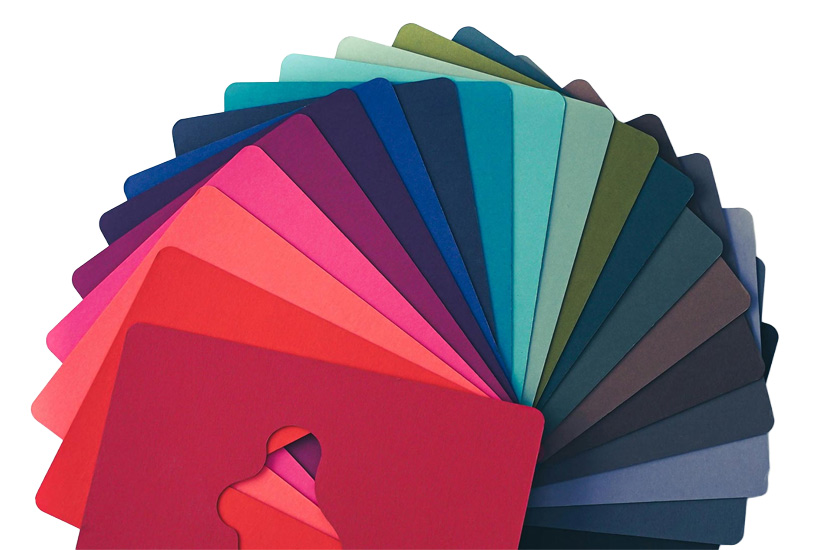
How to Choose the Right Colour Palette for Your Brand
When choosing brand colours, go beyond trends — think strategy.
Ask yourself the following questions:
- How do I want my customers to feel?
- What tone of voice does my business have?
- Will these colours look consistent across print, digital, and social media?
Your colour palette should reflect your brand’s personality, be visually balanced, and work in both light and dark formats.
Need Help with Your Brand Colours?
Choosing the right brand colours can be tricky — but that’s where a professional designer comes in.
At Solestial Design, we help small businesses across Australia create brands that look beautiful and feel right. Whether you’re starting fresh or refreshing your brand palette, we’ll help you find colours that tell your story perfectly.
👉 Let’s bring your brand to life — get in touch today!